For our second week of the Art and Animation Fundamentals, we were tasked with creating a photobashing piece using the program ‘Adobe Photoshop’.
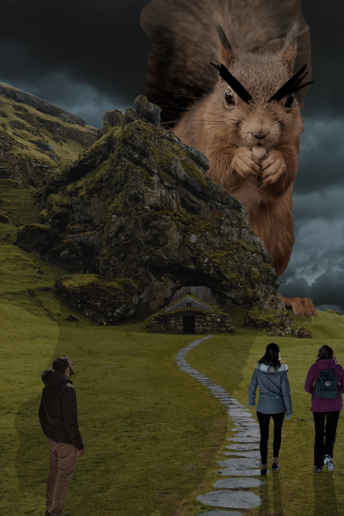
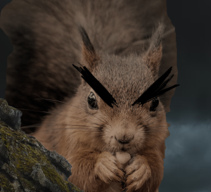
In order to create the photobashing piece, I first took a couple of images from Unsplash.com. I was drawn to the photograph of the mountain and decided that I wanted that to be my centre piece. As I continued to scroll I came across an image of a squrriel which is what resulted in the outcome shown above.
On top of the mountain and the enlarged squrriel, to ensure that a certain atmosphere was created, I decided to include an addition of a grey, cloudy sky. The colours of the original images clashed as they all had different contrasts/brightness; therefore, I needed to adjust the layers so that their colours were matching. To do this, I needed to go to the ‘Image’ tab then select ‘Adjustments’ and then ‘Match Colour’. This allows me to alter the colour of the selected layer to the source layer (the layer in which we would want our colours to match with).
In addition, the process required using the ‘Quick Selection Tool’ to remove some of the mountains in the background. To ensure that the areas I wanted removed were erased, I used the ‘Eraser’ tool to polish the rest of the first image. As for the other images, I used the same process to remove the unwanted background.
To make the image more realistic, I needed to create shadows; so, in order to do that I duplicated the images that needed shadows and used the ‘Paint Bucket Tool’ to fill them black. Since shadows aren’t entirely black, I altered the opacity on each of the layers to a lower percentage and rotated and move the duplicated images so that their appearance would resemble shadows.
Improvements
I believe that there could have been a little more added to the final outcome, because there is a lot of empty space that makes the image feel slightly void. Moreover, I feel as though the colour for the people does not match as well with the stronger colours of the image, so I think that experimenting more with the ‘Match Colour’ tool would allow me to generate better and more accurate results.
In addition, I noticed that there is a visible shadow produced by the squirrel but no shadow for the mountain and house; therefore, adding another shadow and transforming the layer so it is warped accurately would further improve the photoshop image.
Final Thoughts
As this is my first time creating a photoshop manipulation image, I am quite satisfied with the outcome. By using Adobe Photoshop, I given the opportunity to experiment with different edit tools such as ‘Match Colour’ which I had never done before. I also learnt of a new and easier way to create shadows which is extremely helpful and results in an accurate finalised image.