For our third week, we were tasked to create UI buttons for our Cookie Clicker prototype game. My inspiration for my Cookie Clicker were Chinese dumplings, so I created UI buttons that related to that.


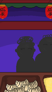
I opted to use the dumpling for the main clicker UI. For the upgrade buttons, I decided to use one of my inspirations for the game as one of them which is my dad. As my dad was the person who taught me how to make dumplings, I thought it was appropriate to create a chef who resembled my dad as one of the upgrade UI buttons.

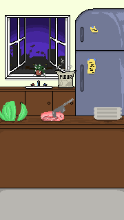
As for the automatic upgrade button, I thought that a food cart would be appropriate as the first background shown in the game is a kitchen, so I believe that to switch from the kitchen to a food cart would be a nice addition to the game!
In addition, I created multiple other UI buttons but I was unable to add them into the game due to some time complications. For the second upgrade button, I had intended on creating a button that resembles Gordon Ramsay. In order to do this, I drew one side of the UI and used the copy and paste edit tool to ensure that the button would be symmetrical.
As for the third upgrade button, I decided to design a restaurant.


My initial intentions for the clipboard with the paper was a menu button. Once the menu button had been clicked, an empty one would appear and display the other upgrade buttons so that the UI buttons would not look out of place due to the background changing.
Improvements
In hindsight, I think that it would be more suitable if my UI buttons looked more like buttons because it was quite difficult to differentiate between the objects in the background and the UI buttons. So to improve, I would alter the appearance of the buttons so they appear to look more like buttons by making them look 3D.
Final Thoughts
As creating the UI buttons were one of the first tasks that we had to complete for our prototype games, I was quite satisfied with the outcome of my artwork. I was able to experiment creating pixel art which I had not done before and create the art centered around a certain theme.
As well as producing the UI buttons, I was also able to create backgrounds for the prototype that linked together with the overall theme of the game. Creating the background allowed me to experiment with different colours for the sky and enabled me to explore different ways of producing a smooth fade between the purple shades.