For the sixth week, we were tasked to create pixel art for our platformer prototype. My initial ideas were inspired by the book ‘Six Crimson Cranes’ by Elizabeth Lim. Within the novel, there is a Princess who is able to give life to a paper crane which she hand crafted herself. Based on that paper crane, I decided to base my prototype game on that.

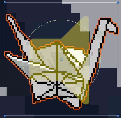
As I wanted the paper crane to be the main focus on the game, I decided that it is going to be the player. So to begin with, I began to create the pixel art version of a paper crane on Clip Studio Paint.
As I have never hand crafted a paper crane before, I used an image that I had found on Google images for reference to draw the sprite as accurately as I could.
Due to the fact that the player is needed to turn both left and right, it is necessary for me to create sprites for the player that is facing left and right. In order to do this, all I needed to do is to produce finalised outcome of the paper crane and flip the canvas vertically. I applied this technique to all left facing sprites to face right.
Furthermore, I needed to create idle and walking animations for the player. I imagined the paper crane moving with its wings, so I simply drew the wings at a slight angle for each frame.
Once the idle animation had been created, I tested the animation out in Unity and realised that the animation appeared as though the paper crane was moving so a walking animation did not seem necessary; however, I attempted to create a walking animation regardless but rather than just its wings flapping, I altered the angle of the neck of the crane so it looked as though there was a slight head bob as it moves. Unfortunately, the walking animation looked strange, so I decided to stick with the original animation for both idle, walking and jumping.
As for the colour choice, I wanted to keep a basic colour scheme that wasn’t too extravagant so I chose for the paper crane to remain white. Although shading is needed for the player, I opted to stay with a monochromatic colour scheme.
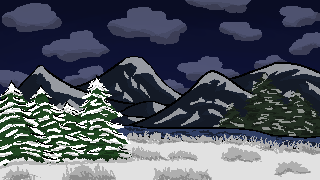
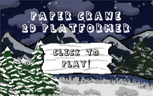
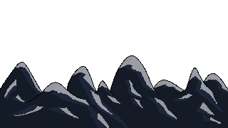
Once I had created the player sprite, I decided to move onto the background. To start with, I had decided on the setting to be in a snowy terrain. As the paper crane is white, I didn’t want it to clash with the snow, so I created the background so that it would be set at a night setting to ensure that you could see the player sprite at all times.
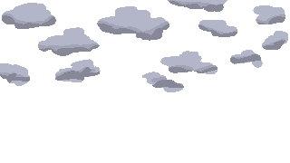
During the process of creating the sky, I experimented with the different shades of dark blue and eventually decided on that specific hue. From there, I added the other little details to the background such as the clouds, mountains and trees. As stated before, the terrain would be snow so to ensure that the background is realistic, I added snow onto the top of the mountains.
Furthermore, as it is set at night, I explored the different grey shades to match the snow on the mountains with the dark sky. As I was adding the outlines of the mountains, I noticed that more black lines for the line art would make the overall image look a little flat; therefore, I experimented with the shade colours that I had previously used for the snow and attempted to create outlines of the mountains with those colours. By doing this, I am able to generate an image that looks softer compared to pure black lines.
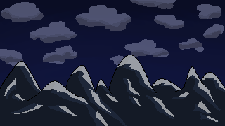
After creating the game background and importing it into Unity, I discovered that I would need the background to move alongside the player as they move along the platforms. This would mean I would need to separate the clouds, mountains and sky into different layers so that they would move individually in the background.


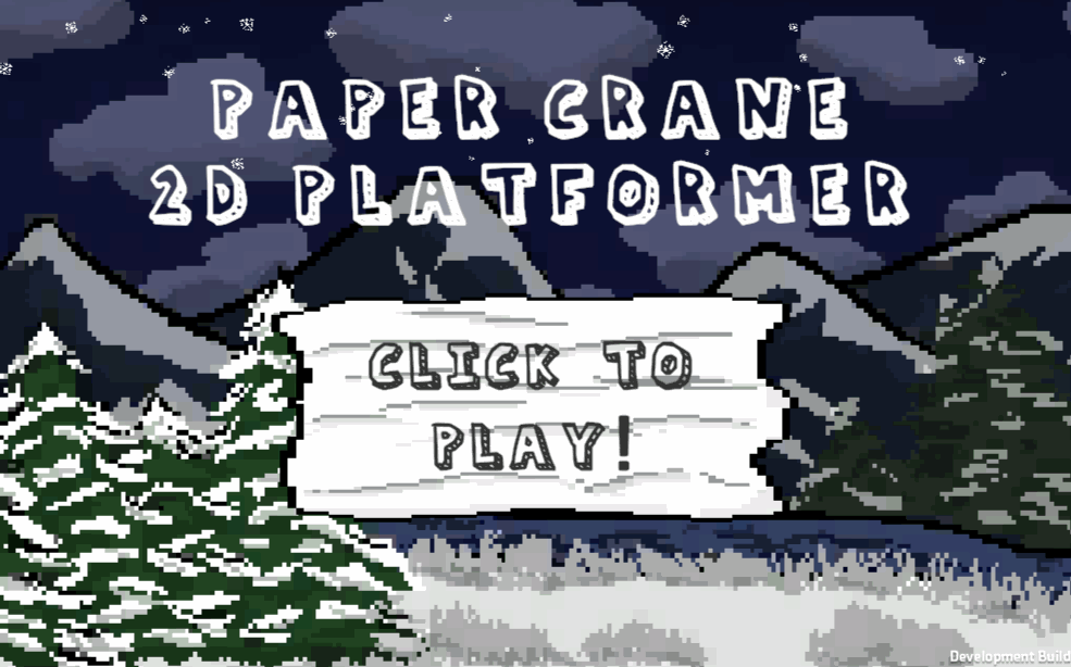
To complete the background inspired by a snowy terrain, I decided to add snowflakes. I was able to create a snow effect in Unity, but I needed to produce my own snowflake sprite otherwise the snow would appear like little balls. To create the snowflake, I use the symmetry tool and copied and pasted the rest to ensure that the snowflake was symmetrical. The finished outcome of the menu background is shown below with the snowflakes falling.


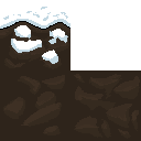
Once the backgrounds were finalised, I needed to create art for the ground which would be used as tiles for the player to walk on. As the theme is snow, I designed the first tile with snow that coated the top of the square. Following on from the previous designs, I used a light grey to create shadows for the snow to ensure that the overall ground tile did not look flat.
In addition to the snow tile, I added dirt tiles to be attached underneath the first tile to give the ground more depth when they are added together. I made sure to create two different dirt tiles so that the ground would not look repetitive.

When designing my levels, I had intended on creating challenging levels so I thought to add checkpoints into my game. To do this, I needed to create a sprite for the checkpoints; however, due to some time restraints, I had to quickly produce a design. I opted for a simple pole for the checkpoint and decided to add thin stripes of red so that it would look noticable and not look too plain.

As there will be enemies in the prototype, I thought that it would appropriate to implement a health system into my game. As the occurring theme of my sprites were all paper related, I decided to design the heart to look as though it was crafted from paper.
Although due to some complications, the heart sprites were not used in the prototype.

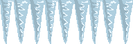
For the prototype, we were tasked to create obstacles for the player to encounter. The obstacles that I decided to create were fire and icicles. During the process of designing these sprites, I attempted to experiment without using black to outline the overall shape like I had done with previous designs that I had produced.
As well as obstacles, enemies are also needed. Referring back to the book that I was inspired by, snakes were also a common enemy; therefore, I decided to implement them into my prototype. Once again, following the paper theme, I designed the snakes in an origami-style so that the theme would be consistent throughout the game. I also liked the idea of using snakes as they are part of the Chinese zodiacs which allowed me to remain consistent with the enemy types; this inspired me to create another enemy based from the Chinese zodiacs, the rat.
In addition, similarly to the player sprite, I wanted the enemy sprites to also have walking animations. Although I did not have enough time to create the code for them to move, the animations worked as I had intended it to.


As my platformer has different levels to the prototype, a clear objective is needed for the player to move onto the next level. From my knowledge of cranes, some of their habitats are located at wetlands where there are also lotus’. This gave me the idea of producing a lotus flower as a sprite to indicate to the player that they can proceed to the next level. As I wanted to maintain the paper theme, I used a reference which I found through Google which teaches you how to create an origami lotus flower; from this, I used the image to design an accurate pixel art drawing of a lotus flower.
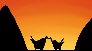
For the final pixel art drawing, I wanted to create an end game background (above). My initial ideas were to keep it simple, so I opted for a silhouette drawing of the paper crane. As the singular paper crane looked a little too plain, I decided to add another; this adds a subtle story to the prototype game which made it feel more complete.
Additionally, as the player progresses through the game, the sky remains night, I believed that once the player reaches the end game, a sunrise would rise up. Although the background does not move, I attempted to create the sunrise in the background of the image. To do this, I used red, orange, and yellow shades and by carefully using the blend tool, I was able to smooth the colours together without messily mixing them up to form one colour.
Improvements
When creating pixel art on a small canvas, it is important for me to remember the little details that are needed to be added to make the art look more detailed/interesting. I believe that I could have achieved better results if I experimented more with shading by using dithering.
Final Thoughts
Overall, I am quite satisfied with the outcome of my sprites and the animation that I had made out of it. Although there were some sprite animations that did not look that appealing, I learnt a lot about creating pixel art through experimenting with the different angles and colour schemes and the importance of minor details to the overall art due to the limited space on the canvas!
[1] RNmaster (n.d) How to Make a Paper Crane [Blog post]. AUTODESK Instructables. n.d. Available online: https://www.instructables.com/How-to-make-a-Paper-Crane-1/ [Accessed 18/11/2022].
[2] Chrissy (2014) Modular Origami Lotus Flower – Video Tutorial [Blog post]. Paper Kawaii. 20 January. Available online: https://www.paperkawaii.com/modular-origami-lotus-flower-video-tutorial/ [Accessed 23/11/2022].